
Widget Flutter Lanjutan 2

·583 words·3 mins· 0
Mobile Developer Flutter Widget Dart Dasar Flutter
iCourse
Author
iCourse
~ lakukan yang terbaik, hidup hanya satu kali ~
Mobile Developer - This article is part of a series.
Part 7: This Article
  • Navigasi Multi Page
  • Card Widget
  • Textfield
  • inkWell
  • AppBar
  • Expanded && Divider
  • ElevatedButton

Navigasi Multi Page #

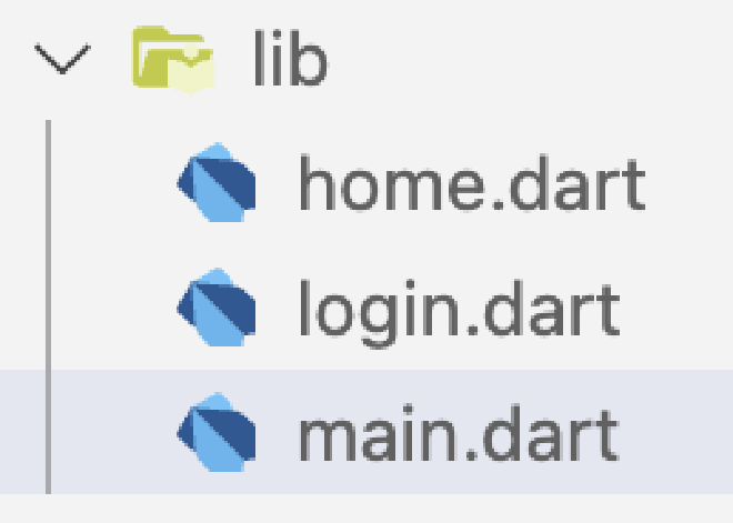
Buat 2 file dengan menggunakan StatelessWidget bernama home.dart dan login.dart pada folder lib :

Create New File

Pada home.dart kita akan memanggil

 1
 2
 3
 4
 5
 6
 7
 8
 9
10
class MainApp extends StatelessWidget {
  const MainApp({super.key});

  @override
  Widget build(BuildContext context) {
    return const MaterialApp(
      home: LoginPage(),
    );
  }
}

Pada login page, kita menggunakan widget Navigator seperti pada baris 17 dan kita memanggil homepage di dalam MaterialPageRoute seperti pada baris ke 21.

 1
 2
 3
 4
 5
 6
 7
 8
 9
10
11
12
13
14
15
16
17
18
19
20
21
22
23
24
25
26
27
28
29
30
31
32
33
class LoginPage extends StatelessWidget {
  const LoginPage({super.key});

  @override
  Widget build(BuildContext context) {
    return Scaffold(
      appBar: AppBar(
        title: const Text("Berkah IT"),
      ),
      body: Center(
        child: Column(
          mainAxisAlignment: MainAxisAlignment.center,
          children: [
            const Text("Ini halaman login"),
            ElevatedButton(
              onPressed: () {
                Navigator.push(
                  context,
                  MaterialPageRoute(
                    builder: (context) {
                      return const HomePage();
                    },
                  ),
                );
              },
              child: const Text("Login"),
            ),
          ],
        ),
      ),
    );
  }
}

Pada home page, kita menggunakan widget Navigator seperti pada baris 17 dan kita memanggil homepage di dalam MaterialPageRoute seperti pada baris ke 21.

 1
 2
 3
 4
 5
 6
 7
 8
 9
10
11
12
13
14
15
16
17
18
19
20
21
22
23
24
25
26
27
28
29
30
31
32
33
class HomePage extends StatelessWidget {
  const HomePage({super.key});

  @override
  Widget build(BuildContext context) {
    return Scaffold(
      appBar: AppBar(
        title: const Text("Berkah IT"),
      ),
      body: Center(
        child: Column(
          mainAxisAlignment: MainAxisAlignment.center,
          children: [
            const Text("Ini halaman Home"),
            ElevatedButton(
              onPressed: () {
                Navigator.pushReplacement(
                  context,
                  MaterialPageRoute(
                    builder: (context) {
                      return const LoginPage();
                    },
                  ),
                );
              },
              child: const Text("Logout"),
            ),
          ],
        ),
      ),
    );
  }
}

Card #

Widget card memiliki ukuran sesuai dengan isi contentnnya.

Parameter widget card :

ParameterFungsi
coloruntuk memberikan background warna pada card
shapeuntuk mengatur bentuk dari border pada card. Disini kita menggunakan widget RoundedRectangleBorder dan memberikan BorderRadius Circular untuk memberikan efek melengkung
shadowColoruntuk mengatur warna shadow dari card
elevationuntuk mengatur size shadow dari card
 1
 2
 3
 4
 5
 6
 7
 8
 9
10
11
12
13
14
body: Center(
    child: Card(
        color: Colors.amber,
        shape: RoundedRectangleBorder(
            borderRadius: BorderRadius.circular(10),
        ),
        shadowColor: Colors.red,
        elevation: 10,
        child: const Padding(
            padding: EdgeInsets.all(100),
            child: Text("Ini card"),
            ),
        ),
    ),

Textfield #

 1
 2
 3
 4
 5
 6
 7
 8
 9
10
11
12
13
14
15
16
17
18
19
20
21
body: Center(
  child: TextField(
    inputFormatters: [FilteringTextInputFormatter.digitsOnly],
    keyboardType: TextInputType.number,
    style: const TextStyle(
      fontSize: 18,
      fontWeight: FontWeight.w600,
      color: Colors.black,
    ),
    decoration: const InputDecoration(
      focusedBorder: OutlineInputBorder(
        borderSide: BorderSide(
          color: Colors.amber,
        ),
      ),
      border: OutlineInputBorder(),
      contentPadding: EdgeInsets.all(13),
      prefix: Icon(Icons.lock),
      ),
    ),
  ),

Inkwell #

body: Center(
  child: InkWell(
    borderRadius: BorderRadius.circular(3),
    splashColor: Colors.amber,
    highlightColor: Colors.white70,
    onTap: () {},
    child: Padding(
      padding: EdgeInsets.all(8.0),
      child: Text("ini inkwell"),
    ),
  ),
),

AppBar #

appBar: AppBar(
  title: const Text(
    "Berkah IT",
    style: TextStyle(
      color: Colors.white,
      fontWeight: FontWeight.w600,
      fontSize: 18,
    ),
  ),
  leading: IconButton(
    icon: const Icon(Icons.arrow_back_ios_new_outlined),
    iconSize: 22,
    color: Colors.white,
    onPressed: () {},
  ),
  elevation: 0,
  centerTitle: true,
  backgroundColor: Colors.amber,
),

Expanded & Divider #

Expanded #

Pembungkus widget agar dapat menyesuaikan ukuran dari wdiget utama.

Divider #

Untuk menampilkan garis lurus.

Expanded(
  child: Divider(
    color: Color(0xffA39797),
    thickness: 1,
  ),
),

ElevatedButton #

ElevatedButton(
  onPressed: () {},
  style: ElevatedButton.styleFrom(
    backgroundColor: const Color(0xFF009688),
    shape: RoundedRectangleBorder(
      borderRadius: BorderRadius.circular(10),
    ),
  ),
  child: const Text(
    "Masuk",
    style: TextStyle(
        fontFamily: "Plus Jakarta Sans",
        fontSize: 20,
        fontWeight: FontWeight.w600),
  ),
),


Mobile Developer - This article is part of a series.
Part 7: This Article